Introduction
I’ve always been fascinated by how data can reveal hidden patterns in everyday life. Like many urban dwellers, I often take taxis to save time—working on my laptop in the back seat instead of zoning out on public transport. But I couldn’t help noticing how wildly the prices fluctuated throughout the day!
For my daily commuting needs, I regularly use Yandex.Taxi (internationally known as Yango), one of the largest ride-hailing services in Eastern Europe. While the app is convenient and the service reliable, I noticed significant price fluctuations depending on the time of day, weather conditions, and other factors that weren’t immediately obvious.
This sparked my curiosity: could I crack the code behind these price surges and save money while still enjoying the convenience? As a data enthusiast who loves a good challenge, I decided to turn this question into a fun weekend project that eventually grew into something much more interesting.
The Challenge
- Decode the mysterious surge-pricing patterns for my daily commute routes
- Build a system that could outsmart the anti-scraping protections (ethically, of course!)
- Create beautiful visualizations that would tell the story hidden in the numbers
How I Built It
Armed with Python and a healthy dose of persistence, I reverse-engineered the taxi-route API and created a data collection system that would make any data nerd proud:
Ninja-level web scraping. I set up a clever rotation of proxies with randomized request patterns that politely collected pricing data without triggering any alarms. The system maintained impressive uptime while respecting the service’s boundaries.
Smart data storage. All those taxi quotes went into a neat SQLite database that adapted itself whenever new vehicle types appeared in the wild. Perfect for a hobby project that needed to be lightweight yet powerful!
Pattern-finding algorithms. The fun part was writing code to calculate daily and weekly patterns—finding those sweet-spot percentiles that revealed when prices typically spike or drop.
Eye-catching visuals. Using Matplotlib, I crafted colorful charts that even non-technical friends found fascinating. The percentile bands made it easy to spot if current prices were “normal” or unusually high.
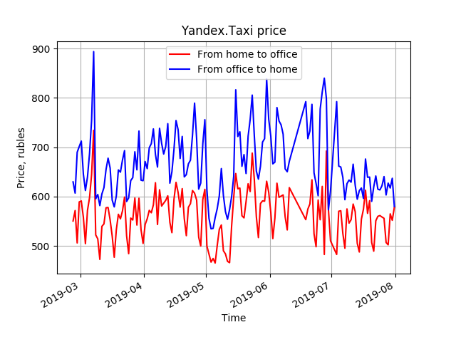
Evolution of taxi fares on the home-office corridor
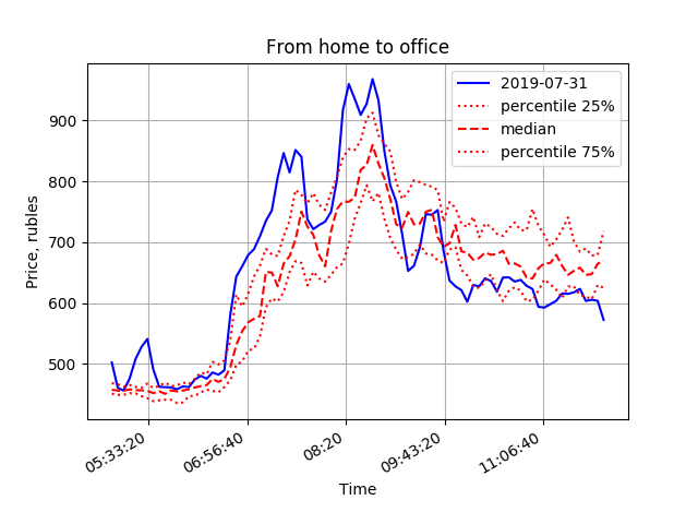
Morning price behaviour
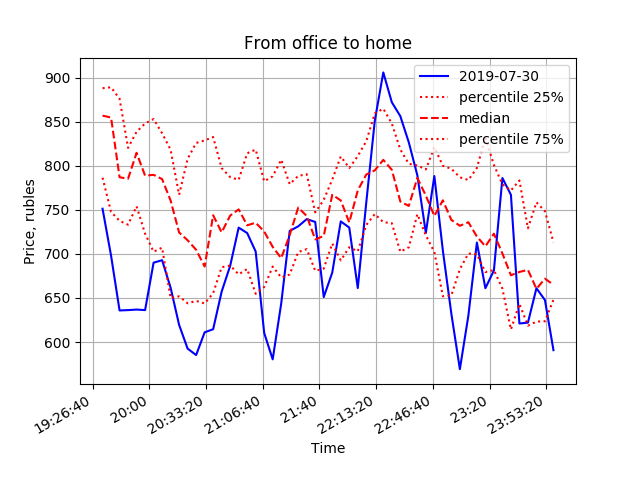
Evening price behaviour
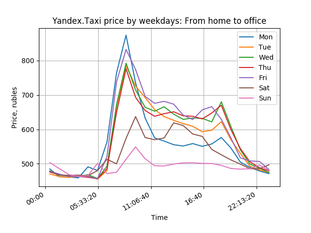
Evening prices to office by weekday
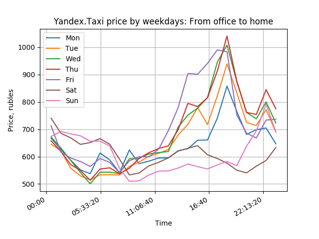
Evening prices to home by weekday
Cool Results
- My prediction algorithm got surprisingly accurate—within about 7% of actual prices 30 minutes in advance.
- I slashed my taxi budget by nearly 20% just by timing my rides better!
- Friends and colleagues began asking for custom versions for their own commutes.
- I even got the chance to present the concept to the Yandex.Taxi team as a potential feature for their app—they were impressed by how a weekend hobby project could extract such actionable insights.
Tools I Played With
Python 3 · Requests · BeautifulSoup · Proxy rotation · SQLite · Pandas · Matplotlib · Cron
What I Learned
This side project reminded me why I love working with data—turning raw numbers into real-world benefits is incredibly satisfying. The best data projects don’t require enterprise-scale resources; sometimes a curious mind, some clever code, and a practical problem are all you need to create something valuable. These are the same principles I apply to larger, more complex challenges in my professional work.